Company
Brand Guidelines & Press Kit
About EachEntry
EachEntry is an AI portal builder for small teams that work with people outside them: programs, member organizations and service businesses. Describe who signs in and what each person needs, and EachEntry builds a branded portal on its own database, with logins, forms, approvals, status tracking and a view for each person that shows only what's theirs. Paid plans are a flat price per portal with unlimited users.
EachEntry was founded in 2020 by Samantha Wong and Luannie Dang in Melbourne, Australia. Press inquiries: [email protected].
Logo
Our logo is two things: a symbol and the EachEntry wordmark. The symbol is four nodes around a corner stroke — one entry, routed and recorded.
Colors
The mark is two colours: blue for the nodes, green for the stroke. Cyan carries the interface — buttons, links, anything you can press — and near-black sets the wordmark and the body type. White is the ground the logo is drawn for.
Logo Lockup
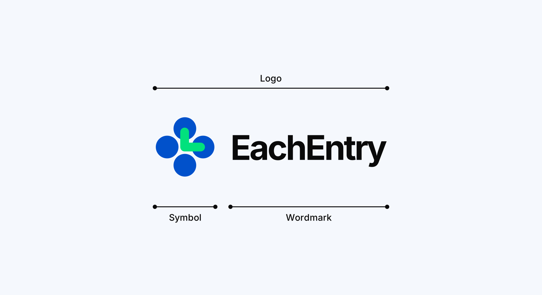
We have two elements within our logo lockup: the EachEntry symbol and wordmark. The symbol and the wordmark can each be used on their own, depending on the application.
Logo Spacing
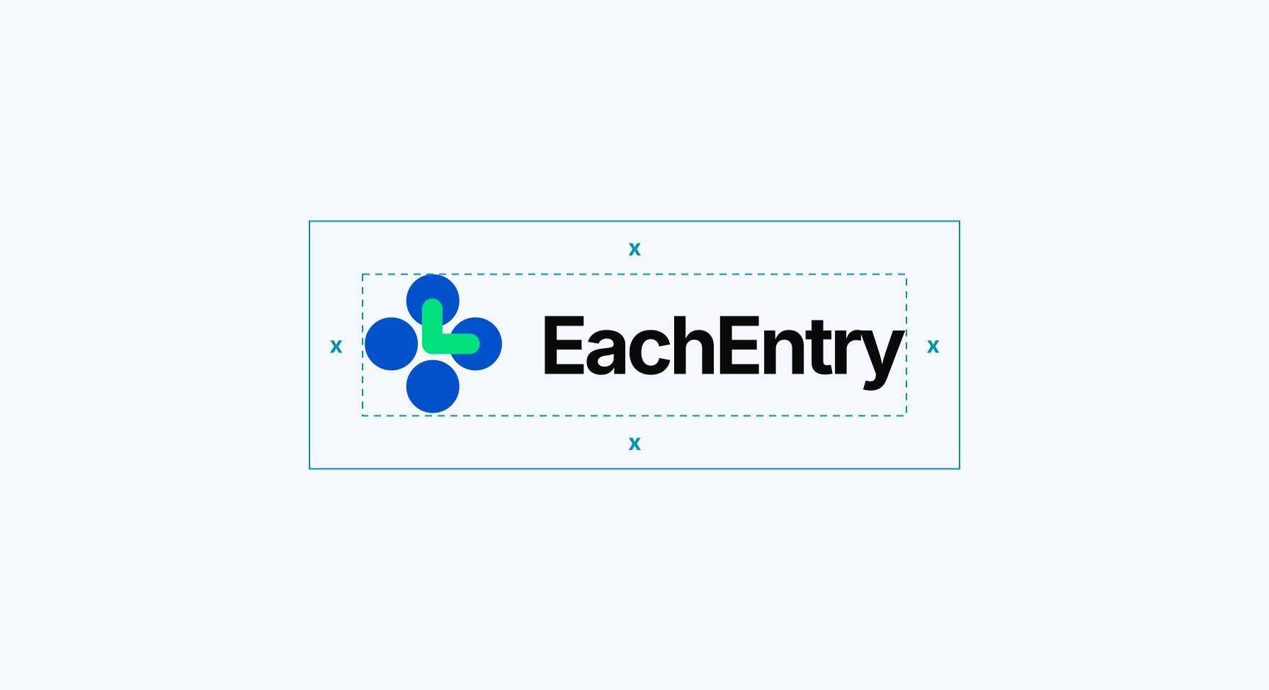
Give the logo room. The unit is one node diameter — three eighths of the symbol’s height — and that is the least space to leave between the logo and anything around it.
Logo Scale
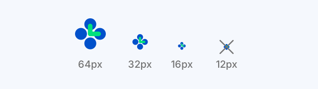
The symbol holds together down to 16px, which is what our favicon is. Below that the four nodes close up into one shape, so don't reproduce it any smaller. The full lockup needs 24px of symbol height before the wordmark stops being readable.
Logo Symbol
The symbol can stand on its own in tight spaces, such as icons, social media avatars and keynote slides.
Application Examples
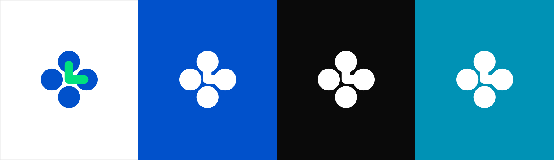
Full colour on white. On blue, ink or cyan, use the white symbol — the green stroke goes muddy against a dark ground. There is a one-colour version in the press kit too, for anywhere that prints in a single ink.